13 August 2026
A globe is a trap
We cut a globe from the pack and replaced it with book ends. The rule that came out of it now filters every asset list before a single piece gets designed.
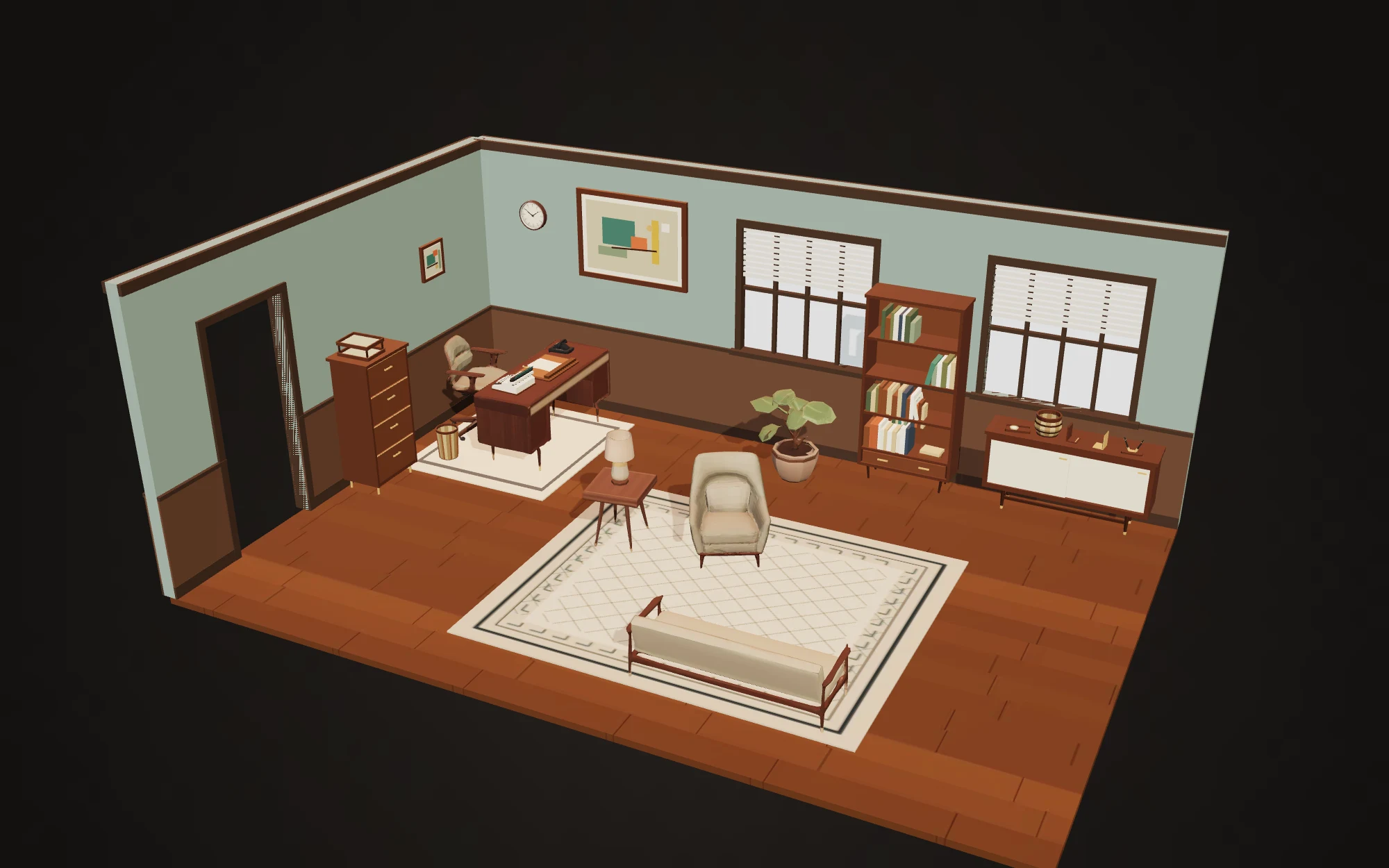
Our 1960s office set had a desk globe in it. Of course it did — a walnut-and-brass globe on a stand is about as mid-century-office as an object gets.
It was also the worst asset in the pack, and it stayed the worst asset through three attempts.
Why it kept failing
Not geometry. The sphere was fine, the meridian ring was fine, the stand was fine. What failed was the map.
A globe’s quality is decided almost entirely by whether the continents look like the continents. Ours looked like abstract blobs — recognisably land-shaped, arranged in roughly the right places, and unmistakably wrong to anybody who has seen a map. The back hemisphere was bald. There was a seam.
Every fix made it worse in a different way. Sharpen the coastlines and you need place names, and place names on a stylized prop are a localisation problem and a legibility problem at once. Abstract them further and it stops reading as Earth and starts reading as a decorative ball. There is no setting between those two that is a good globe at this budget.
The verdict, when it came, was blunt: that is not a globe any more. Take the globe out.
The rule underneath
The interesting part was the follow-up question — not “how do we fix the globe” but “what else is like the globe, and can we stop putting those in the list?”
The answer generalised cleanly. Avoid props whose quality depends on specific representational content. Maps. Paintings with real subjects. Photographs. Faces. Signage. Readable lettering. Anything where the viewer arrives with a precise mental model of what the content should be, and can therefore see exactly how far off yours is.
Compare that with a bookcase. Nobody has strong expectations about a bookcase. It needs shelves at plausible spacings and a plausible wood tone, and beyond that a huge range of executions all read as correct. A globe has one correct answer and everybody knows it.
This is not a tooling problem, incidentally. At 8,000 triangles and a 512-pixel texture there is no room for a convincing world map no matter who makes it or how. The object is asking for fidelity the format cannot give it.
What it changed
The rule is now a filter that runs on the asset list before anything gets designed. Every proposed piece gets asked one question: does this object’s quality depend on getting specific representational content right? If yes, it does not go in the pack.
We kept two pieces of wall art, because they are geometric compositions — colour fields and bars, no subject, nothing anybody has expectations about. They pass on all five angles. A landscape in the same frame would not have.
The globe was replaced with a pair of book ends: an L-shaped pair, one walnut, one brass, seventy-two triangles between them. First audit, straight pass.
The uncomfortable version
There is a reading of this that says we avoided a hard problem, and that reading is correct. We did.
But an asset pack is not a portfolio. Nobody buys twenty-seven props to admire the one difficult object; they buy them to dress a room. A pack of twenty-seven pieces that are all clean is worth more than a pack of twenty-six clean pieces and one ambitious globe that gives the whole set away the moment a player walks up to the desk.
Choosing what not to build is a real part of the craft, and it is cheaper than any other quality improvement available. The globe cost us three rebuild rounds. The rule that replaced it costs nothing and runs before the money is spent.
craft selection quality
More
- Inspected from where? We thought the pack was nearly finished. Then somebody asked which angle we had been inspecting from, and the pass rate went to eleven out of twenty-seven.
- Why we build props with code Most of this pack is a few hundred lines of Blender Python per asset. Not a position on craft — it was the cheapest way to make a fix cost nothing.